DAVID KRUT PROJECTS, NEW YORK IS PLEASED TO PRESENT:
“Why an artist makes and should make prints, how prints are made, and the business of print publishing have been the main topics of conversation over the last fifteen years of working with David Krut in New York City, Johannesburg and London. No matter where we are or what we are working on bringing into the world, the stories about how and why a particular work exists are often as intriguing as the works themselves. As printers and publishers, we have a unique perspective on the creative process of artists because we are present for the decisions, the inspirations, and the heartaches.” – Master Printer Phil Sanders, 2024
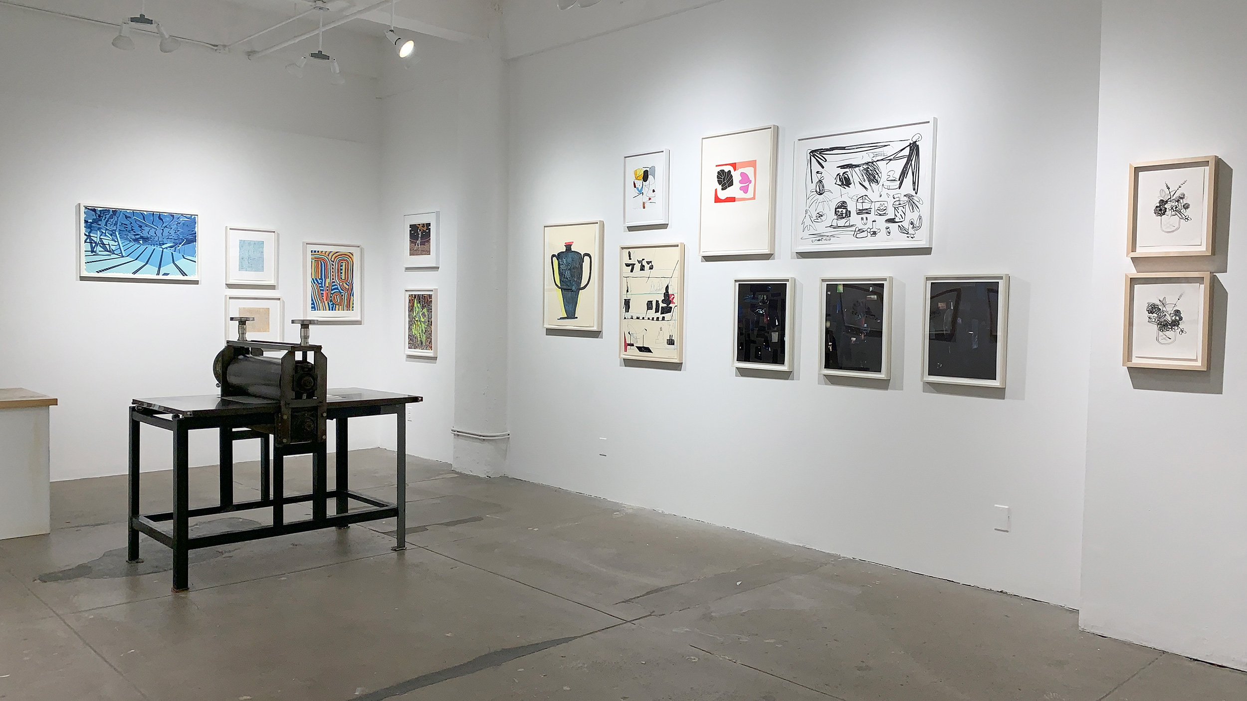
Printer’s Picks: A Look at Priorities and Processes was on view from February 13th – March 22nd, 2024, presenting a selection of works from artists, printers, and publishers within the orbit of David Krut Projects in New York. Some of the works have not been seen in years, while others are hot off the press. Their unifying factor is an unyielding pursuit of the artists’ intentions. This online extension to the physical exhibition includes anecdotal information about the making and the meanings behind each work from the perspectives of the people involved in their creation.
Master Printer Phil Sanders, the visionary behind Printer’s Picks, is a printmaking expert, educator, and founder of PS Marlowe in Asheville, NC. With over two decades in the field, Sanders champions artists and fosters cultural growth through collaborative printmaking.
Former COO of The Elizabeth Foundation for the Arts in NYC, Sanders spearheaded the Robert Blackburn Printmaking Workshop, influencing luminaries like Jasper Johns and Helen Frankenthaler. His prints adorn prestigious collections worldwide, including The Metropolitan Museum of Art and Yale University Art Gallery. Sanders’ commitment to education led him to teach courses at Stanford University, and he’s collaborated on instructional videos with MoMA. His seminal book, Prints and Their Makers, reshapes contemporary printmaking discourse. Since 2008, Sanders has partnered with David Krut Projects, shaping pivotal projects at the Johannesburg workshop with artists like Deborah Bell and Mikhael Subotzky.
For Printer’s Picks, Sanders curated pieces from his extensive collaborations.

Please note that pricing excludes shipping and any applicable sales tax, and that pricing and availability are subject to change without advance notice.

Alex Dodge
In the wake of total happiness, 2013
6 color UV silkscreen with braille texture on two ply museum board
20 × 32 in
Edition of 30
Printed by Luther Davis at Axelle Editions
Published by Forth Estate
$3,000 unframed
Note from the Curator:
This screenprint by Alex Dodge, “In the wake of total happiness”, utilizes industrial screen print technology for a fine art purpose, using UV Braille ink to create a physical surface to many of the parts of the print. When you look closely, the tiles themselves are actually raised – your fingers can feel the bumps of the grout lines between. There’s a swirling surface of the water that at an angle catches with a slight shine of a semi-gloss ink.
The print itself is a sequel to an earlier work that Dodge did with Luther Davis, titled “Everything appears as it is, infinite”, where it takes the serene environment of the swimming pool and turns it up on its head with the world falling inside. As Dodge once told me about this print, it was as if you were on a cruise ship, in the swimming pool, and the ship started going down.
Alex Dodge is a contemporary American artist celebrated for his innovative approach to painting and printmaking. Born in 1977, Dodge studied at the Rhode Island School of Design, where he developed his distinctive artistic style. Dodge’s work is characterized by its exploration of technology, identity, and perception, often blurring the lines between the digital and physical worlds.
Dodge is known for his use of digital tools and techniques in his art, creating intricate patterns and textures that challenge traditional notions of painting. His work often features vibrant colors and dynamic compositions, reflecting his fascination with the intersection of art and technology. Dodge’s art has been exhibited widely in galleries and museums around the world, earning him a reputation as one of the leading contemporary artists of his generation.
His work is held in numerous public and private collections, including the Whitney Museum of American Art, the Museum of Modern Art, and the Metropolitan Museum of Art. In addition to his artistic practice, Dodge is also a skilled printmaker, exploring new techniques and approaches to printmaking. His innovative use of technology and his ability to push the boundaries of traditional mediums have established him as a significant figure in the contemporary art world.

James Siena
Epicrania, 2023
2 color lithograph on Magnani Pescia Paper
13.375 x 15.125 in
Edition of 40
Printed by Phil Sanders and Lindsey Sigmon
Published by PS Marlowe, Asheville NC
$1,750 framed

James Siena
Reseda II, 2023
2 color lithograph on Magnani Pescia Paper
15.125 x 13.375 in
Edition of 28
Printed by Phil Sanders and Lindsey Sigmon
Published by PS Marlowe, Asheville NC
$1,750 framed
Note from the Curator:
I’ve been working on prints with James Siena for 20 years now, but “Reseda II” and “Epicrania” are the first of his prints I have published. For me, these two encapsulate a great deal of what James is about artistically. He’s really about the relationship that colors have, the relationship of the linework, the positive and negative space that’s created – and he’s also very interested in how we perceive work up close and at a distance. With these works, it was about how they would be drawn to allow the white spaces between the line and the wash work to become their own line, active in their own way.
We tried many different color variations, and chose the ones that had the greatest balance of creating one feel from a distance and a different one that helped heighten the detail up close, while at the same time keeping them unified. It’s a difficult and complicated thing to do with print, but it’s something that James is not only interested in but has dedicated a large portion of his career in printmaking to.
He has often commented that the faith Master Printers have had in him helped instill the confidence to push further and farther than he would normally be comfortable with. The relationship between the printer and artist helps propel work in new directions, and for James keeps things interesting.
James Siena is a highly acclaimed American artist celebrated for his innovative approach to printmaking. Born in 1957 in California, Siena’s work is renowned for its intricate patterns, geometric precision, and meticulous attention to detail. He studied at Cornell University and currently resides in New York City, where he continues to push the boundaries of printmaking as a medium.
Siena’s printmaking practice is characterized by its exploration of complex, abstract forms and structures. He often employs traditional printmaking techniques such as etching and engraving, but with a unique twist that sets his work apart. Siena’s prints are known for their vibrant colors, rhythmic patterns, and mesmerizing complexity, inviting viewers to delve deep into the intricate worlds he creates.
Throughout his career, Siena has received widespread recognition for his printmaking, with his work being featured in numerous exhibitions and collections worldwide. His art is held in prestigious institutions such as the Museum of Modern Art in New York and the Smithsonian American Art Museum in Washington, D.C. Siena’s innovative approach to printmaking continues to captivate audiences and cement his status as a leading figure in contemporary art.

Glen Baldridge
No Way, 2022
28 color silkscreen on Coventry Rag
20 x 16 in
Edition of 25
Printed by Du-Good Press
Published by Du-Good Press
$1,300 framed

Glen Baldridge
No Way, 2022
18 color screenprint on Coventry Rag
24 x 18 in
Edition of 40
Printed by Carlisle Printmaking in Portland, Maine
Published by 0verrrun
$1,900 framed
Note from the Curator:
Glen Baldridge’s 28-color screenprint “No Way” was printed by Leslie Diuguid and published by her company Du-good Press, founded in 2017 in Brooklyn. Du-good Press is the first black and female-owned fine art screenprinting business in New York City. Leslie worked under many different master printers, honing her craft before opening her own studio. It’s during this time that Glenn got to know her and was one of the first artists that she worked with as a publisher herself.
Baldridge’s work deals with the co-opting of counterculture by mainstream culture. This print is both complicated in its printing, complex in its imagery, and complex in its conceptual focus. It has references to psychedelic art, drug culture, jam bands, paper marbling…old and new visual concepts that are woven in. There’s the hidden text that some people may have a difficult time finding, but once you do, you can’t stop looking.
Glen Baldridge, born in 1977 in Edmonton, Canada, is a prominent contemporary artist recognized for his innovative approach to printmaking and multidisciplinary practice. He earned his Bachelor of Fine Arts from the Rhode Island School of Design in 1999 and his Master of Fine Arts from Columbia University in 2004. Baldridge’s work often explores themes of perception, memory, and the relationship between the natural and human-made environments.
He is known for his experimental techniques in printmaking, which frequently incorporate unconventional materials and challenge traditional notions of the medium. Baldridge has exhibited extensively both nationally and internationally, with his work featured in solo and group shows at prestigious institutions and galleries. His art can be found in the collections of prominent museums such as the Museum of Modern Art, the Whitney Museum of American Art, and the Brooklyn Museum. In addition to his artistic practice, Baldridge has taught at institutions such as Columbia University and the School of Visual Arts in New York City, further contributing to the contemporary art discourse. His work continues to be celebrated for its conceptual depth and technical innovation, solidifying his place as a significant figure in contemporary art.

Butt Johnson
Slam Dunk ’87, 2007
7 color hot stamp foil and 3 color enamel screenprint on 4-ply museum board
15.5 x 18.25 in
Edition of 30
Printed by Luther Davis at Axelle Editions
Published by Forth Estate
$3,800 framed
Note from the Curator:
Butt Johnson’s “Slam Dunk” is based on the Nintendo game “Double Dribble”, often considered the first true basketball video game. The image is from the scene when a player would slam dunk a ball. It would break away to this graphic of the player moving through the air and all the lights and cameras flashing.
Technically, the print is complicated. It’s a 7-color hot stamp foil and 3-color enamel screenprint on 4-ply museum board. It’s got depth and texture from the embossing of the hot foil stamping, a process that you may be familiar with in foil stamped books. They can sometimes have very complicated patterns, but you often will only see two, maybe three, colors. What you see with “Slam Dunk” is the process of this old foil stamping technique being used in a pixelated format, like the graphics of early video games.
As you move across the work, it almost seems to flicker as it did with the video game. The image glitters and flashes as you walk by. The enamel screenprint has a sheen that has its own reflective quality. It’s on museum board so that it can handle the embossment, as well as all the manipulation and the building up of the screenprint. It’s unlike anything else you’ll see. The print is not only nostalgia for a lot of people of that generation who first played those video games, but really a hallmark of how digital technology can be merged with old technology, which is a mainstay in printmaking.
Butt Johnson is a contemporary American artist renowned for his innovative approach to printmaking. Born in 1972, Johnson studied at the School of Visual Arts in New York City, where he honed his skills and developed his distinctive artistic style.
Johnson’s work in printmaking is characterized by its bold and graphic quality, often featuring dynamic compositions and vibrant colors. Johnson’s prints draw inspiration from a variety of sources, including urban landscapes, pop culture, and everyday objects. He is known for his experimental techniques, such as combining traditional printmaking methods with digital processes, to create works that are both visually striking and conceptually rich.
Johnson has exhibited his prints widely in galleries and museums around the world, earning him a reputation as one of the leading contemporary printmakers of his generation. His prints are held in numerous public and private collections, including the Museum of Modern Art, the Whitney Museum of American Art, and the Brooklyn Museum.
In addition to his printmaking practice, Johnson is also a skilled painter and sculptor, creating works that explore similar themes and motifs across different mediums. His contributions to the art world continue to be celebrated for their innovation, creativity, and ability to push the boundaries of printmaking.


Joseph Hart
Nine Ideas, 2013
1 plate, 1 color intaglio: etching, aquatint, spitbite and 9 piece chine-collé
16.5 x 13.5 in
Edition of 25
Printed by Phil Sanders at Robert Blackburn Printmaking Workshop
Published by David Krut Projects, New York
$1,400 unframed
Note from the Curator:
Deliberate color selection played an important part in these two untitled watercolor monotypes and etching by Joseph Hart. One of the nicest parts of the monotypes is his use of white, which came from a white, water-soluable crayon. In “Untitled (Shelf)”, it’s interesting to see how it intersects with the lines, and how it (and the blue) intersects with the washes. In “Untitled (Trophy)”, he was all about the washes and the individual brush strokes, and how you could make the color pop. The white crayon makes an interesting appearance as the shadow of the handle. The selection of the buff-colored paper was a pretty important element to the success of the white sections because it allowed him to get a beautiful two-tone effect he wouldn’t have been able to achieve on a brighter paper.
In “Nine Ideas”, a very specific copper foil was selected not only for its color, but for its reflective quality and how it changes at different angles and in different lights. The other colors of the print are chine-collé pieces, and you’ll see that the edges are not quite perfectly aligned with the linework in the etching – this was a deliberate decision, because Hart didn’t want it to be too perfect.
Joseph Hart is a contemporary American artist acclaimed for his abstract paintings and drawings. Born in 1976, Hart studied at the University of North Texas and later received his MFA from the University of Illinois at Chicago. Known for his intricate compositions and use of line and form, Hart’s work explores themes of perception, memory, and the subconscious.
Hart’s art is characterized by its dynamic energy and rhythmic patterns, often created through repetitive mark-making and layering. His work is deeply influenced by music, literature, and the natural world, resulting in paintings and drawings that are both visually striking and emotionally resonant. Hart has exhibited his work extensively in galleries and museums throughout the United States and abroad.
His art is held in numerous public and private collections, including the Museum of Modern Art in New York City and the Whitney Museum of American Art. In addition to his artistic practice, Hart is also known for his work as a curator and educator. He has curated several exhibitions exploring contemporary drawing practices and has taught at institutions such as the School of Visual Arts in New York City. Hart’s contributions to the art world continue to be celebrated for their innovation, beauty, and thoughtfulness.


Tomory Dodge
Under Triple Moons, 2013
Triptych; 17 color screenprint on Coventry Rag 335 gsm
18 x 14 in ea
Edition of 35
Published by Forth Estate
$3,600 framed
Note from the Curator:
Tomory Dodge’s triptych “Under Triple Moons” utilizes multiple layers of screenprint and different levels of sheen to create an incredible facsimile of a collage, giving the appearance of being highly textured while actually being completely flat. The areas that seem to be comprised of small, torn-up pieces of paper were achieved by creativity in coloring; the edges were intentionally printed off-register to show a tiny bit of the white paper the triptych was printed on, and you’ll see that some “pieces” use different levels of darkness to create depth, giving the illusion of one piece of paper being glued and creased over another’s edge.
Tomory Dodge is a prominent American artist known for his dynamic and expressive abstract paintings. Born in 1974, Dodge received his MFA from the California Institute of the Arts and has since gained recognition for his innovative approach to color, form, and composition.
Dodge’s work is characterized by its vibrant colors, energetic brushwork, and layered textures, which create a sense of movement and depth. He draws inspiration from a wide range of sources, including urban landscapes, digital imagery, and art history, resulting in paintings that are both visually compelling and intellectually engaging.
Dodge has exhibited his work extensively in galleries and museums around the world, including the Whitney Museum of American Art, the Museum of Contemporary Art, Los Angeles, and the Saatchi Gallery in London. His art is held in numerous public and private collections, and he is considered a leading figure in contemporary abstract painting. In addition to his artistic practice, Dodge is also a respected educator, having taught at institutions such as the University of California, Los Angeles, and the Otis College of Art and Design. His contributions to the art world continue to be celebrated for their innovation, beauty, and complexity.

Eddie Martinez
Untitled, 2009
Watercolor monotype
22.24 x 30 in
Printed by Phil Sanders at Robert Blackburn Printmaking Workshop
Published by Forth Estate
$35,300 framed
Note from the Curator:
This untitled watercolor monotype by Eddie Martinez was printed at the Robert Blackburn Printmaking Workshop as part of an intensive 5-day working period. It was Eddie’s first foray into printmaking, where he made the drypoint series “Against the Wind”, more than 20 monotypes, and the 21-color lithograph screenprint combination “Clam Appeal”. This print has much of the iconography that Eddie’s early career made him well known for, such as the figures, the clam, the tabletops, and the plants.
Eddie really gravitated towards working with watercolor monotype because it afforded him a different way to draw as well as paint. When you look closely, you can see an almost fluid, drawn mark-making, achieved by dampening a water-soluble pencil or crayon and using that dampness to slide across the non-absorbent Lexan surface from which he worked. During this time, Eddie learned how he could utilize the uniqueness of the mark-making capabilities of the process into something that lives somewhere between that of a lithograph, a drawing, and a watercolor – things you can do on the plate you could never do on a sheet of paper. It’s these unique qualities that have kept him making monotypes to this day.


Eddie Martinez
Against the Wind, 2009
Suite of 7 drypoints on Hahnemühle Copper Etch paper with
hand-printed lithograph colophon on Hahnemühle Copper Etch paper and hand printed lithograph cover on Fabriano Tiziano paper
12.25 x 13.5 in ea
Edition of 15
Printed by Phil Sanders at Robert Blackburn Printmaking Workshop
Published by Forth Estate
$46,200 framed
Note from the Curator:
“Against the Wind” was Eddie’s first experiment with drypoint, depicting the general iconography present within his paintings at that time. There were originally two more plates in the series – those were his learning curve, his experimentation. It was on these plates that he came to understand how the tools he was using would translate to ink on paper and how to work back into the plate or mar the plate, removing burrs, using the scraper and roulettes to create tone. They allowed him to gain confidence in the mark making, which is why the subsequent works we see within this series are so vibrant and vital – they are directly as the artist made them.
There are only two prints within the series that Eddie went back into, and this was minimally – it was just to beef up some of the blacks and a few dark, dark areas. When you look at an image like the skull, what you’re seeing is an amazing level of gray tonality in parts of that print – that was achieved by scraping back. Other than that, Eddie really did not want to go back into the plates. This is rare. Most artists go back in and work and rework plates and intaglio processes, especially drypoint. But for Eddie, it was important to capture the immediacy of the mark making.
Eddie Martinez is a versatile contemporary artist recognized for his dynamic and expressive printmaking practice. Born in 1977 in Groton, Connecticut, Martinez has gained acclaim for his distinctive style that fuses elements of abstraction, figuration, and graffiti art. While he is renowned for his paintings and drawings, Martinez’s printmaking stands out for its unique approach and aesthetic.
Martinez’s printmaking is characterized by its bold compositions, vibrant colors, and intricate textures. He employs a variety of techniques, including etching, lithography, and screen printing, to create prints that are visually striking and conceptually engaging. His prints often feature layered imagery and spontaneous mark-making, reflecting his improvisational and experimental approach to art-making.
In addition to his technical skill, Martinez’s printmaking is notable for its thematic depth. He often draws inspiration from his surroundings, incorporating elements of urban life, pop culture, and personal experiences into his prints. This results in works that are not only visually compelling but also rich in narrative and meaning.
Martinez’s prints have been exhibited in galleries and museums worldwide, earning him a reputation as a leading figure in contemporary printmaking. His work is held in numerous public and private collections, and he continues to push the boundaries of the medium with his innovative and imaginative approach.


Sara Sanders lives and works in Asheville, North Carolina. Sanders’ work has been exhibited nationally and internationally and has been acquired by numerous public and private collections, most notably: The Metropolitan Museum of Art, NY; Library of Congress, Washington, DC; New York Public Library; RISD Museum; Christie’s Education; Fidelity Investments; and Hess Inc. Sanders received a BFA in Studio Art focusing on printmaking, and a minor in Art History from the University of Florida. Her fine art prints have been published by Forth Estate, Brooklyn, NY; Robert Blackburn Printmaking Workshop, NY, NY; Flying Horse Editions, Orlando, FL; David Krut Workshop, Johannesburg, SA/ New York City. Sanders’ work has also been included in the recent publication, Prints and Their Makers, by Princeton Architectural Press.
Sanders spent years working in the high-end interior design industry in New York City and San Francisco, working with clients and art collectors to place artwork and specify finishes – everything from fabrics, furniture, and wallpaper to lighting and tile. This experience helped to hone her eye and her attention to the small details of our interior environments that are so integral to the quality of our lived experience. Years of living and working in the concrete jungle of New York City awakened in her a yearning to be closer to nature, and an acute awareness of the value that both the urban landscape and our precious plant companions bring to our lives.


William Kentridge
Universal Archive (Ref 07, 35, 52, 19 & 53), 2012
Linocuts printed on Shorter Oxford English Dictionary on Velin Arches Cover White, 400gsm
13.5 x 10.5 inches (each)
Edition of 20 (each)
Printed and published by David Krut Workshop, Johannesburg
Contact for pricing
Note from David Krut Workshop (DKW):
William Kentridge’s “Universal Archive” began in 2012 at the David Krut Workshop and is made up of linocuts printed onto non-archival dictionary and encyclopedia paper from the 1950’s. The series contains over 70 individual works, depicting everyday images such as coffee pots, trees, cats, female nudes, typewriters, horses, and birds.
Kentridge is well-known for his work in printmaking. In the “Universal Archive” series, gestural marks are achieved in linocut with a remarkable likeness to an ink drawing. The prints began as simple Indian ink drawings, for which Kentridge used what he calls a “good brush” and a “bad brush”. The former refers to the pristine new brush, which gives perfectly intentional lines. The latter has damaged, splayed bristles which gives a less certain mark. Artists tend to discard the worn, mistreated brush, but Kentridge embraces its individual qualities.
Jillian Ross, former Master Printer of the David Krut Workshop and longtime collaborator with Kentridge, headed the printing process. She stresses that an in-depth understanding of the series requires knowledge of the multiplicity of Kentridge’s projects where the same imagery recurs in varying forms. “Because he often works on a number of projects at once, his ideas for one project tend to fuel another. Images that you see in ‘Universal Archive’ overlap considerably across many mediums.” Ross adds that she sees the title as a reference to his personal ‘universal archive’ – the themes and images that he repeatedly draws on to animate his work. Ross indicates that it is important to note that while most artists approach printmaking as a secondary medium, Kentridge treats it as a fundamental tool to continually develop and improve his practice.
William Kentridge, born in 1955 in Johannesburg, South Africa, is a prolific multidisciplinary artist known for his groundbreaking work in printmaking, painting, sculpture, theatre, opera, drawing, animation, and filmmaking. Kentridge’s innovative approach to art combines traditional and contemporary mediums, such as film and charcoal, earning him a reputation as a maverick in the arts. While he does not categorize himself as a “political artist,” Kentridge’s work is deeply intertwined with South Africa’s complex history and current socio-political climate.
Kentridge is a modern pioneer in printmaking, viewing it as a multi-disciplinary practice where drawings and theatre projects often stem from his prints, and vice versa. He describes etching as a complex form of animation, constantly reworking a single plate to create different states. His work is characterized by the interrelatedness of his various forms, with narrative strands flowing from one project to another.
As the recipient of numerous awards and honorary titles, Kentridge is considered one of the most significant artists of our time. His work is featured in prestigious collections worldwide, including The Museum of Modern Art in New York, the Art Institute of Chicago, and the Tate Gallery in London. In 2017, Kentridge founded The Centre for the Less Good Idea, an interdisciplinary arts incubator in Johannesburg. His recent solo exhibitions include MUDAM Luxembourg (2021), Musée Métropole d’art moderne in Lille (LaM) (2020), and Norval Foundation and Zeitz MOCAA in Cape Town, South Africa (2019–2020) and a major retrospective at The Royal Academy in London, 2022.

Senzo Shabangu
Endless Journey I, 2011
Linocut
30 x 52.5 in
Edition of 10
SOLD
Note from David Krut Workshop (DKW):
The very thing that gives Johannesburg its appeal is in many ways what makes it difficult to accept – its naked honesty. The city does not hide its problems or weaknesses from view. It exposes them openly, from the potholes and beggars in the streets to the opulence of the high-rise buildings that tower over its inhabitants. Senzo Shabangu sees the possibility of people being larger than that and being able to rise above it. Shabangu’s work looks at the pressure that drives people into the ground as being the same stress and tension that motivates people to persevere in a place that is wrought with potential. His art is his way of understanding himself within the chaos and infinite prospects of Johannesburg.
“Endless Journey I” is part of a series of four linocuts based on the interior of the artist’s home. This image is Shabangu’s tribute to his own work and an externalization of an internal reflection. The image was carved by the artist, and the matrix consists of seven pieces that fit together like a puzzle. Each variation was printed on an etching press using a combination of relief and etching inks.
Senzo Shabangu, born in 1985 in Driefontein, Mpumalanga, draws deeply from his childhood experiences, having spent a significant part of his early years at an apostolic mission station. This formative period continues to influence his work, with imagery from his past frequently appearing in his art. Despite initially aspiring to become a pilot, Shabangu’s path led him to Johannesburg in 2006, where he discovered a passion for printmaking through the Taxi Art Education Program at the Johannesburg Central Library. He then pursued formal artistic training at the Artist Proof Studio in Newtown from 2006 to 2008, although he had been drawing independently since childhood.
Shabangu’s talent quickly garnered attention, leading to notable opportunities early in his career. In 2008, his work was chosen to represent the Many Voices, One Movement Global Conference, where he created a series of linocut prints for the attendees. His art was also selected for the advertising of the World Art Summit at Museum Africa in 2009. The following year, Shabangu was honored with the David Koloane Award, which granted him a four-month residency at the Bag Factory. Under the mentorship of renowned artists David Koloane and Pat Mautloa, Shabangu collaborated with artists from around the world, further enriching his artistic journey.
Shabangu’s monotypes often depict scenes of the Johannesburg CBD, highlighting city landscapes that seem to both envelop and suspend his characters, creating a sense of being surrounded by the urban environment. His work explores themes of movement within the city and the impact of forced removals, reflecting on the lives of its inhabitants and the political complexities they face. Additionally, Shabangu is deeply committed to community work and supporting emerging artists. His experiences, including a transformative trip to the Biennale in Kampala, Uganda, have fueled his drive to share his knowledge and provide exposure for African artists on the global stage. Despite his growing artistic acclaim, Shabangu has not forgotten his childhood dream of becoming a pilot, and in 2012, he embarked on his pilot training at Rand Airport.


Sam Nhlengethwa
Marikana strike is worrying, 2012
Hardground etching, spit bite, aquatint and drypoint on Gampi chine-collé
14 x 19.5 in
Edition of 25
Printed and published by David Krut Workshop, Johannesburg
$800 framed

Sam Nhlengethwa
Hayi wena… you lie, 2012
Hardground etching, spit bite, aquatint and drypoint on Gampi chine-collé
14 x 19.5 in
Edition of 25
Printed and published by David Krut Workshop, Johannesburg
$800 framed
Note from David Krut Workshop (DKW):
This selection by Sam Nhlengthwa is from a series of five prints printed at the David Krut Workshop (DKW) using a custom combination of black Charbonnel etching inks on white gampi, 20 gsm paper. “Hayi Wena…you lie”, as well as the other prints in the series, focuses on conversation as a basic human interaction in a variety of social contexts. The titles of the works came to Nhlengethwa as snippets of overheard conversations; some topical, some trivial. He has “always been inspired by people and their surroundings” and these images represent the vitality and humor of the people of Johannesburg. According to Nhlengethwa, to read the titles is to hear the conversations and to think, “this is us.”
“Marikana Strike is Worrying” was created in response to the Marikana massacre – a miner’s strike that occurred in 2012. Miners were striking for wage increases, but the strike wasn’t authorized by any union, making it illegal. A week into the strike, the South African Police force opened fire on a group of striking miners at the Marikana mine in the North West Province of South Africa. Thirty-four miners were killed, and multiple injuries and arrests occurred. It was a huge tragedy and a fatal breakdown of communication between civilians, unions, and government officials, which is still seen as a significant point of tension in South Africa.
Sam Nhlengethwa stands out as one of South Africa’s most prominent artists, renowned for his profound contributions to the art world. Born in 1955, he honed his artistic skills at Rorke’s Drift and the Johannesburg Art Foundation. Nhlengethwa’s talent was recognized early on, earning him the prestigious Standard Bank Young Artist of the Year award in 1994, a significant year for South Africa as it marked the first democratic elections.
Nhlengethwa’s artistic journey has taken him across the globe, with successful exhibitions spanning from Senegal to New York and Cologne. His work is revered and featured in major public and corporate art collections both in South Africa and internationally. Post-Apartheid, Nhlengethwa has evolved his style and themes, delving into new territories such as music, particularly jazz, and the intricacies of daily life.
Urban-born, Nhlengethwa’s art is deeply rooted in township existence, reflecting his intimate connection with these environments. His works often incorporate found printed images from posters and magazines, interwoven with his personal memories of township life. Nhlengethwa’s artistry extends to his prints, where he explores the movement of people and the essence of spaces, paying homage to individuals and places through his compelling creations.

Dread Scott
Peking University 1967, 2011
6 color silkscreen
16.875 x 21.375 in
Edition of 25
Printed by Luther Davis at Axelle Editions
Published by Forth Estate
$1,000 framed

Dread Scott
Shenyang 1967, 2011
6 color silkscreenon Gampi chine-collé
16.875 x 21.375 in
Edition of 25
Printed by Luther Davis at Axelle Editions
Published by Forth Estate
$1,000 framed
Note from the Curator:
Dread Scott is a multidisciplinary artist best known for his performances and what he has described as his “revolutionary art”. Scott often uses historic, revolutionary events to discuss and highlight events going on today. Scott’s screenprints “Shenyang 1967” and “Peking University 1967” are both drawn from the conflict in China at that time. The process of screenprint allowed him to easily and clearly demonstrate the whitewashing of history by literally whitewashing these photographs out. It’s a physical print, almost as if he has painted it. This was done by repeated layering of white screenprint over the underlying imagery.
For every artist, printmaking has its own reason for being, and many gravitate towards it because it allows them to say something physically that they may not be able to say in another way. In this case, by working in multiples, it allowed Scott to have the artworks presented in multiple places at the same time, over a long period of time. It keeps the conversation going and for an artist like Dread Scott, that is the point of the work. The work of the revolutionary artist is to keep the conversation going towards evolving society, towards working together to get out of and avoid conflict.
Dread Scott is a prominent American artist renowned for his innovative and provocative approach to printmaking. Born in 1965, Scott’s work challenges societal norms and addresses issues of race, power, and history. He studied at the School of the Art Institute of Chicago, where he honed his skills and developed his unique artistic voice.
Scott’s printmaking is characterized by its bold imagery, powerful messages, and use of various techniques such as etching, lithography, and screen printing. His prints often incorporate text, found imagery, and historical references, creating works that are both visually striking and intellectually stimulating.
One of Scott’s most notable works is his 1989 installation What Is the Proper Way to Display a U.S. Flag? which sparked nationwide controversy and a Supreme Court case. This installation featured a flag on the floor where viewers were invited to walk on it, challenging ideas of patriotism and freedom of expression.
Scott’s prints have been exhibited in galleries and museums around the world, earning him acclaim for his fearless exploration of complex issues. His work is held in numerous public and private collections, and he continues to push the boundaries of printmaking as a medium for social and political commentary.
Deborah Bell
Reveal, 2014
Chine-Collé, drypoint, roulette, spit bite
19.5 x 15 in
Edition of 40
Printed and published by David Krut Workshop, Johannesburg
$1,200 framed
Note from the Artist:
“The ‘Reveal’ series of drypoint etchings continue to expand on the themes that evolved through a series of paintings I did between 2012 and 2014. In these, I was using Velázquez’s ‘Las Meninas’ (1656 – 57) as a source, to explore imagination, creativity and the studio space as an alchemical workshop. I was interested in the dark studio space as a symbol of the brain, and the artist’s canvas was represented either blank – the tabula rasa awaiting inspiration – or turned around showing its back – representing hidden knowledge.
The angel in the doorway is derived from a quickly made sketch in my notebook from Picasso’s painting ‘Las Meninas’ (1957), also based on the Velázquez work. In my drawing, the cloak of the man in the doorway suggested wings, and this led me to think further on the idea of the brain, the third eye, and the source of inspiration. The figure that swoops down alludes to my work done in the early 1990s and can also be the muse, or the higher or future self. I had made another sketch from Picasso of the handmaiden handing the Infanta a jug on a tray, and in my drawing these become free floating – caught in the moment. These etchings in the ‘Reveal’ series are about that moment. That moment of recognition – the revelation of divine truth.”
– Text from Deborah Bell: Invocations to the Plate. Notes from the Print Workshop 2014 – 2017.
Deborah Bell is a renowned South African artist known for her captivating blend of traditional printmaking techniques and contemporary themes. Born in 1957, Bell studied Fine Arts at the University of the Witwatersrand in Johannesburg, where she honed her skills and developed her unique artistic voice. Bell’s work is deeply influenced by her cultural heritage, often incorporating symbols and motifs from African mythology and spirituality.
Her art is characterized by intricate details, vibrant colors, and rich symbolism, reflecting her exploration of identity, memory, and the human experience. Throughout her career, Bell has collaborated with master printer Phil Sanders at the Tamarind Institute, pushing the boundaries of printmaking and showcasing her innovative approach to the medium.
Her art has been exhibited extensively both in South Africa and internationally, earning her widespread acclaim and recognition. Deborah Bell’s work can be found in numerous public and private collections, including the British Museum, the Victoria and Albert Museum, and the Museum of Modern Art in New York. In addition to her artistic practice, Bell is also a respected teacher and mentor, inspiring new generations of artists with her legacy.

Diane Victor
Birth of a Nation: Leda and the White Backed Vulture, 2009
2 color lithograph on Magnani Pescia Paper
15.125 x 13.375 in
Edition of 28
Printed and published by David Krut Workshop, Johannesburg
$1,500 unframed

Diane Victor
Birth of a Nation: Minotaur, 2009
2 color lithograph on Magnani Pescia Paper
15.125 x 13.375 in
Edition of 28
Printed and published by David Krut Workshop, Johannesburg
$1,500 unframed
Note from David Krut Workshop (DKW):
“Birth of a Nation” comprises of a suite of ten etchings using imagery that is adapted from classical mythology to a South African context of visuality. The tension generated by Diane Victor’s impressive body of drawings and prints arises not simply from her biting social commentary and the macabre nature of many of her images, but from interplay between the tough and the fragile, between the hard edges of her visual narratives and the delicate mark-making of her preferred media. This series of drypoints evolved from a set of large-scale charcoal drawings. Her prints, rather than being a distillation of the drawings, seem rather to intensify her technique, focusing attention on minute marks and exquisitely fine lines. The series is characterised by a copper matrix drawn using a drypoint needle and a variety of roulette tools to build up an immensely detailed surface.
The series takes a familiar set of classical stories and superimposes on them African themes and landscapes. The story of “Leda and the Swan” for example, becomes a violent encounter between a semi-autobiographical female figure and a white-backed vulture. With “Birth of a Nation: Minotaur”, Victor highlights the difficulty in negotiating cultural traditions within contemporary expectations; the hero’s killing of the bull in the classical labyrinth is lauded yet a similar action performed in Africa now enlists an extremely different response.
Her work can be described as social commentary, but what is sometimes missed, perhaps because her strong imagery repels the faint-hearted before they can have a proper look, is its humor. This is presented either in the form of biting satire or revealed in the artist’s wry self-deprecation. Victor’s unorthodox recasting of well-used narratives presents a psychological landscape that is as funny as it is disturbing.
Diane Victor, born in Witbank, South Africa, in 1964, is a highly acclaimed artist known for her remarkable contributions to the world of printmaking. She earned her BA Fine Arts Degree from the University of the Witwatersrand in Johannesburg, specializing in Printmaking. Victor’s talent was quickly recognized, as she graduated with distinction and received various awards, including the prestigious Volkskas Atelier Award in 1988, making her the youngest recipient at the time.
The Volkskas Award granted Victor a transformative ten-month stay at the Cité International des Artes in Paris, where she collaborated with experienced printmakers and immersed herself in a different society, profoundly influencing her artistic perspective. Since 1990, Victor has shared her expertise as a part-time lecturer, teaching drawing and printmaking at several South African institutions, including the University of Pretoria, Wits Technikon, and Rhodes University.
Victor’s body of work is marked by a compelling tension, stemming from her incisive social commentary and confrontational nature of her images and narratives. Her artistry shines through the juxtaposition of tough, hard-edged visual narratives and the delicate, fragile mark-making of her preferred media. Some of her most notable works include Disasters of Peace and No Country for Old Women, which exemplify her ability to capture complex themes with a raw and evocative aesthetic. Through her art, Victor continues to push boundaries and challenge perceptions, solidifying her reputation as one of South Africa’s most influential contemporary artists.


Kiki Smith
Variety Flowers, 2014
Etching, aquatint and drypoint on Hahnemühle bright white paper
19.5 x 15 in
Edition of 13
Printed by Harlan & Weaver
Contact for price

Kiki Smith
Touch (Portfolio of 6 prints with a poem by Hery Cole), 2006
Aquatint, etching and drypoint on Hahnemühle bright white paper
30 x 22 in
Edition of 33
Printed by Harlan & Weaver
Available as a set only
Contact for price

Kate Shepherd
Glsas, 2011
20 color silkscreen print
24 x 18.25 in
Edition of 30
$2,200 unframed


Interested to see what else we have to show in New York?
Visit davidkrutprojects.com to explore our available artworks &
Email info@davidkrut.com to schedule a viewing
David Krut Projects, New York
526 West 26th Street, Suite 816
New York, New York 10001
T. 212-255-3094 | E. info@davidkrut.com
Hours: Tuesday – Saturday, 11-6pm